Creating a multi-column glossary in HTML5/CSS3
Recently, I needed to create a glossary design for a website where I work as freelancer (currently, I am still a student and I work on this project during my spare time). A glossary layout could be very straightforward. For example, putting one word per line.
Unfortunately (on an other hand, it is a good thing because it allowed me to write this post 😉), in my project, we want a glossary which have a layout like indexes at the end of books. The first stage to tackle this issue is to know if a solution already exists. Unfortunately, no solution can be accepted.
The thing which come closest to my need is the CSS3 multiple columns. So, I used as an entry point to find a solution.
The HTML structure
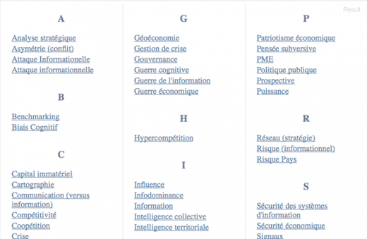
The HTML elements are very straightforward: the idea is to put a title for each alphabet letter. And, a letter will be followed by words that begin with this letter. Here is an example (it is in French, consider as a lorem ipsum):
<div class="lexique">
    <div class="set">
        <h3 class="letter">A</h3>
        <ul class="word">
            <li><a href="">Analyse stratégique</a></li>
            <li><a href="">Asymétrie (conflit)</a></li>
            <li><a href="">Attaque Informationelle</a></li>
            <li><a href="">Attaque informationnelle</a></li>
        </ul>
    </div>

    <div class="set">
        <h3 class="letter">B</h3>
        <ul class="word">
            <li><a href="">Benchmarking</a></li>
            <li><a href="">Biais Cognitif</a></li>
        </ul>
    </div>

    <div class="set">
        <h3 class="letter">C</h3>
        <ul class="word">
...
</div>
You can find the whole example on jsfiddle.
CSS multi-column layouts
Thanks to new CSS3 properties, HTML elements can split into multiple columns. We can use float property but the disadvantage is that words have a horizontal order (this does not look like a glossary). First of all, using column-count property is a good way to have words in vertically order with multiple columns:
div.lexique {
  -webkit-column-count: 3;
  -moz-column-count: 3;
  -o-column-count: 3;
  -ms-column-count: 3;
  column-count: 3;
}
Unfortunately, as you can see here, it remains small details that need to be fixed. The first problem is that a letter could be placed at the end of a column. So, column-break-inside property will help us:
div.set {
  -webkit-column-break-inside: avoid;
  -moz-column-break-inside: avoid;
  -o-column-break-inside: avoid;
  -ms-column-break-inside: avoid;
  column-break-inside: avoid;
}
You will find here an example. The second issue is that the first letter have an offset. So, we need to fix that:
div.set {
  display: inline-block;
  width: 100%;
  ...;
}
You can visualise the example here. display: inline-block; allows to avoid the offset but it creates another bug. Indeed, when the words are short, they may overlap. So, we need to add width: 100%;.
Adding a little cosmetics
We will add a vertical separator by applying column-rule:
div.lexique
{
    ...
    -webkit-column-rule: 1px dotted #ccc;
    -moz-column-rule: 1px dotted #ccc;
    -o-column-rule: 1px dotted #ccc;
    -ms-column-rule: 1px dotted #ccc;
    column-rule: 1px dotted #ccc;
}
Responsive design
Thanks to @Daniel comment, we can also improve the glossary by using CSS3 media queries:
@media screen and (max-width: 768px) {
  div.lexique {
    -webkit-column-count: 2;
    -moz-column-count: 2;
    -o-column-count: 2;
    -ms-column-count: 2;
    column-count: 2;
  }
}

@media screen and (max-width: 480px) {
  div.lexique {
    -webkit-column-count: 1;
    -moz-column-count: 1;
    -o-column-count: 1;
    -ms-column-count: 1;
    column-count: 1;
    -webkit-column-rule: none;
    -moz-column-rule: none;
    -o-column-rule: none;
    -ms-column-rule: none;
    column-rule: none;
  }
}
And, we will also add some color on letters and definitions, delete list-style-type, etc. So, you can find the whole result at this link: